University of Southern California Student Portal
Client
University of Southern California
Industry
Education
Services Provided
Content Strategy
Information Architecture
Process Mapping
Content Design
Description
What do you do when the initiative to create an engaging digital experience that mirrors campus life results in a website that lacks a clear purpose?
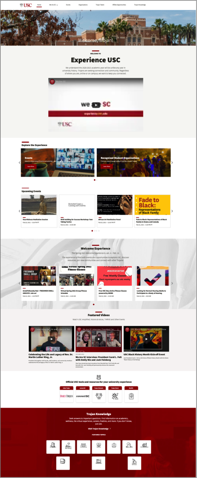
With the onset of Covid and the resulting lockdown, USC created a student portal that focused on engagement to give students a sense of the spirit and camaraderie of campus life. “Experience USC” was built in under 2 months.
Objective
Establish governance around engagement content and make recommendations for the future of content on the student portal. My analysis unearthed challenges and an overlooked opportunity.
My Process in a Nutshell
1. Research and discovery
I had in-depth conversations with stakeholders and reviewed existing user research reports, taking the time to understand the students, the university and USC’s ecosystem of content.
2. Audit the status quo
I conducted a content audit of the student portal and a preliminary audit of USC websites. I also did a deep dive into the portal platform to understand technical constraints.
3. Cultivate a culture of content
I made presentations to raise awareness about the value of content strategy: it was important that the team learn how to manage content as the portal evolved.
4. Analysis that translates research into insight
Based on user research, I recommended changes to information architecture and content design to provide more value to students.
5. The solution
A plan for delivering a reimagined student portal, shifting away from engagement content to a focus on the knowledge base
Content Governance
To establish content governance, I:
- interviewed stakeholders involved in the publishing workflow
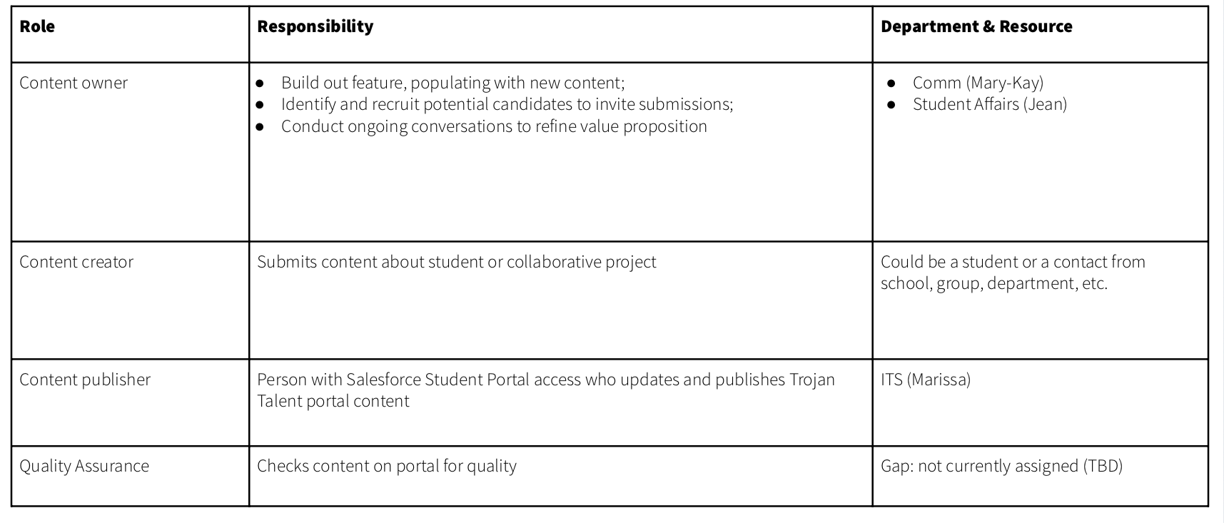
- got agreement on roles and responsibilities, and worked through areas of disagreement
- documented content publishing workflows
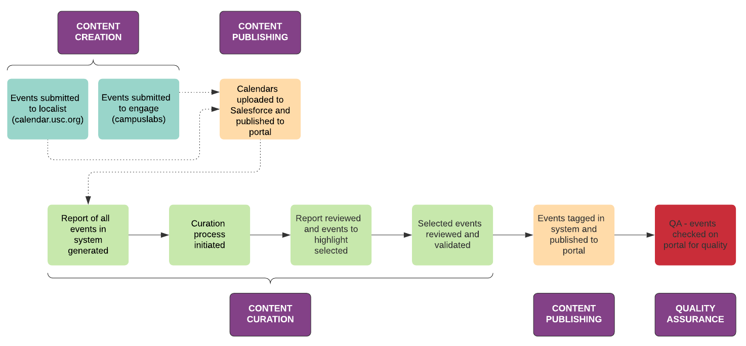
- created diagrams that illustrate publishing workflow steps, identifying gaps and areas in need of improvement
- developed editorial calendar
Who does what? Getting agreement on roles and responsibilities in the publishing workflow is an essential component of content governance.
What’s the process and timeline? I mapped tasks to a high-level category so the team could begin to look at content through the lens of a basic publishing workflow.
Cultivating a Culture of Content
To cultivate a culture of content, I led presentations to help stakeholders understand the importance of content strategy and the structure of content at USC.
Structure: the shape of content*
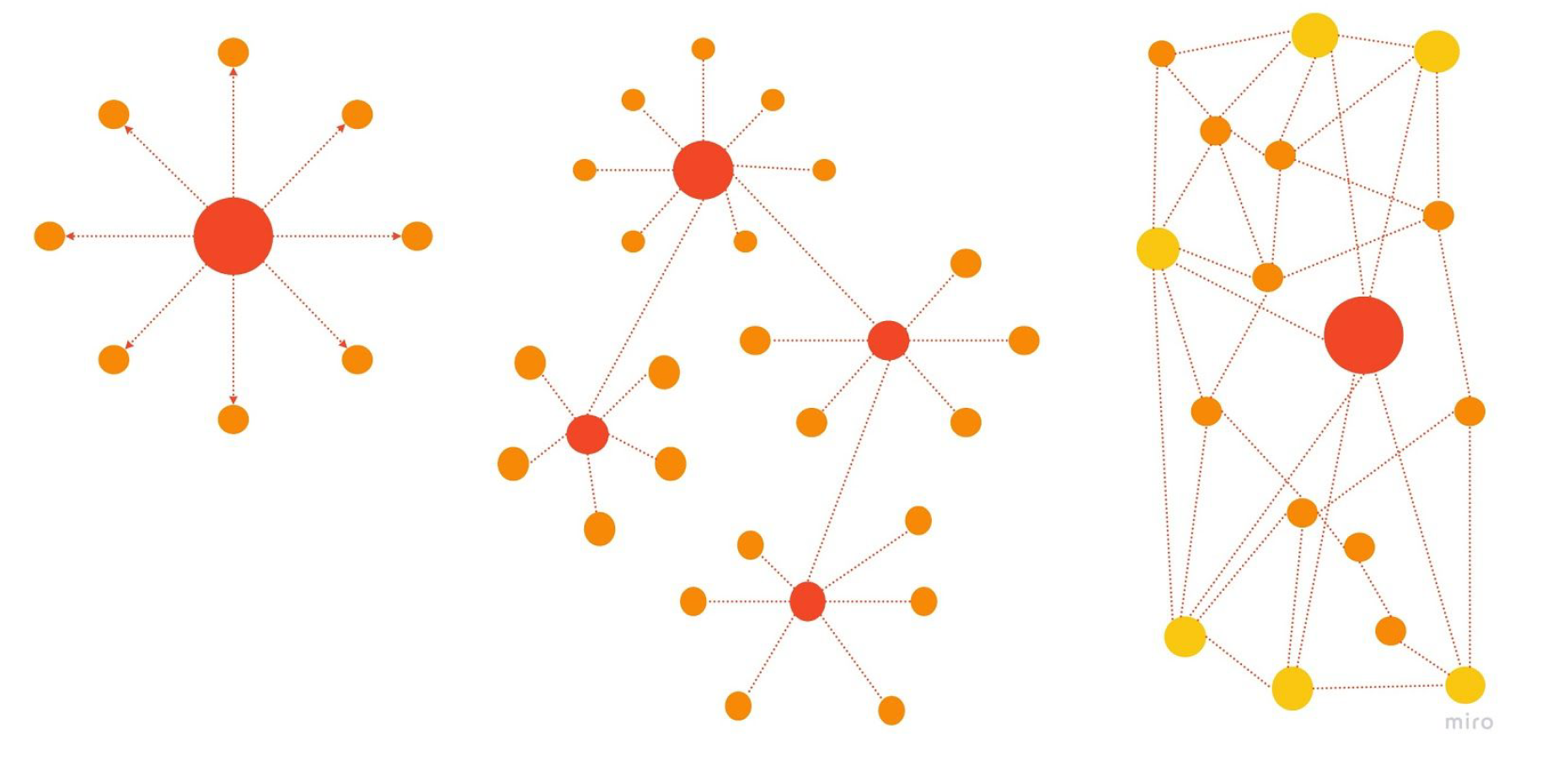
Centralized: a central team “owns” and controls content for the entire organization
Decentralized: different departments take responsibility for their content, with little to no direction from the center
Distributed: a central content team provides leadership and support. Departments have autonomy but everyone shares content and best practice.
USC: a whole universe of content

*images and content adapted from gathercontent.com
With a decentralized content structure, it’s challenging to ensure content quality throughout an organization. I propagated the concepts of content strategy to raise awareness about its value so the concepts could begin to take root across the university.
Content Audit
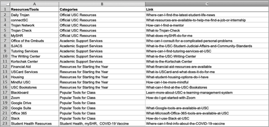
Trojan Knowledge Content Inventory:
Content audit and feature analysis:
- Student feedback positive: they see the feature as a great resource
- Issues around findability
- Could be more comprehensive: lots of opportunity to expand content and value
- Quality issues: some links go to error pages; some links go to old content
- Lack of ownership: need to establish governance with roles, responsibilities and processes
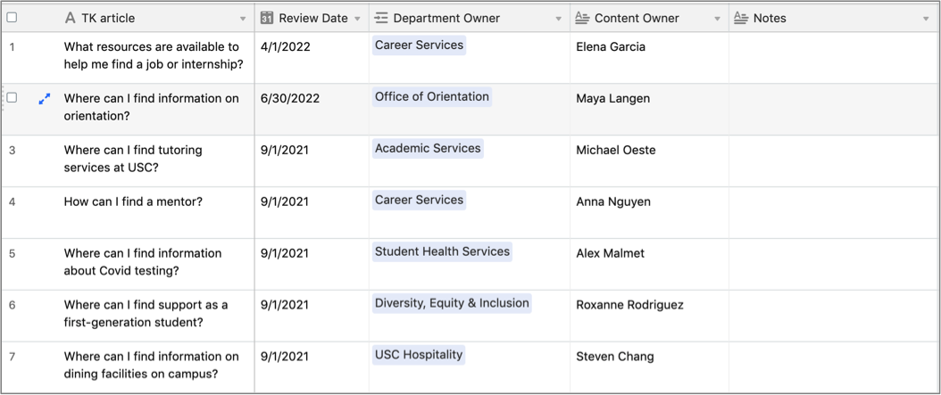
- Need to develop editorial calendar
Draft editorial calendar:
Information Architecture
Current navigation:

Recommended navigation:

- Remove “We Are SC” from main menu: label doesn’t convey meaning; content in drop-down menu is hidden: make content accessible via alternative navigation design pattern.
- Place “Trojan Knowledge” in more prominent position: the knowledge base is the most important feature on the portal so it needs to be more visible (normally, last item in nav is a good spot for high-value content but in the portal, the last nav item is often hidden under “More” drop-down menu). Do label testing to explore better options for the feature name.
- Change “Organizations” to “Student Orgs” to align with the language students use for this category.
- Add “Tools & Resources” to main navigation: students expressed a strong interest in a comprehensive, searchable inventory of tools and resources to support their entire student journey, including academics, social life and career.
- Do label testing on “Trojan Talent” and clarify positioning of feature (i.e., stakeholders and students seemed unclear on the goals and strategy for this feature).
- Remove “Offsite Opportunities” feature from navigation and portal. Stakeholders and students confirmed it didn’t make sense to include this feature (a list of social media accounts for organizations loosely affiliated with the university) on the student portal.
Recommended page design:

1.
Content targeting newer students, who need more support. Update this content throughout the year in sync with editorial calendar and determined with stakeholder input.
2.
Links to high-value tools and resources at top of home page to easily connect students to information they need
3.
Curated list of questions that spotlight knowledge base and drive students to the browsable feature.
When accessing knowledge base through linking from questions, search capability is not available, so include search CTA prominently to highlight this functionality.
4.
Give higher visibility to equity and inclusion programs to engage students from these communities and promote USC’s commitment to diversity.
